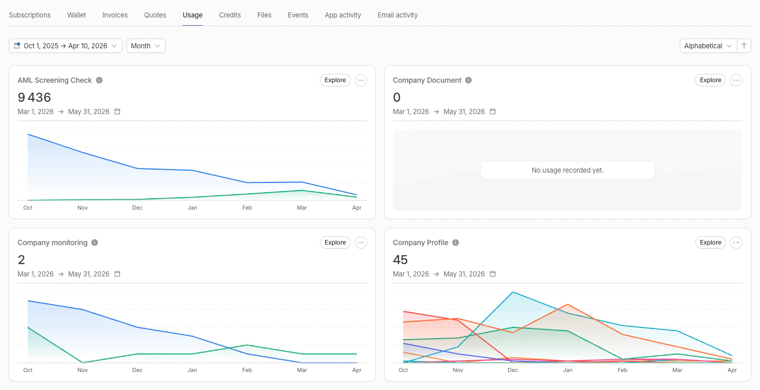
Aggregator cards
Each aggregator is displayed as a card showing:- Aggregator name and linked subscription (if any)
- Current aggregated value for the active metering period
- Area chart of the aggregated value evolution over time (last 6 months by default)
- Threshold lines displayed as dashed horizontal references on the chart, with the operator and value as labels (see thresholds)
Filters on charts
When an aggregator has aggregator filters defined, the chart displays one line per filter with a distinct color. A legend below the chart identifies each filter by name.Card display logic
The Usage tab handles different scenarios to avoid duplicated cards:| Scenario | Display |
|---|---|
| Aggregator from a subscription | Current value + subscription’s metering period |
| Custom aggregator + 1 subscription | Current value + that subscription’s metering period |
| Custom aggregator + multiple subscriptions | One card per subscription, each with its own metering period |
| Custom aggregator + no subscription | Aggregated value for the last month |
Period range and grouping
Use the date range picker at the top of the Usage tab to select a custom period. You can also choose how data is grouped:| Group by | Best for |
|---|---|
| Monthly | Long-term trends (presets: last 3/6/12 months, current/past year) |
| Daily | Weekly or monthly analysis (presets: this/last week, current/past month) |
| Hourly | Intraday monitoring (presets: today, yesterday, this/last week) |
1.2K instead of 1,200).
Sorting
You can sort aggregator cards by:- Name (ascending or descending)
- Current value (ascending or descending)
Explore consumption
Click Explore on any aggregator card to open a side panel with the underlying events. The selected date range and grouping are forwarded to the panel. The exploration panel provides:- Event list filtered on the aggregator’s event key, with timestamps and values
- Search to find specific events
- Date range filter to narrow the time window
- Filter selector to view events matching a specific aggregator filter
- Pagination for browsing through large event sets
Related
- Global usage — same charts aggregated across all customers, with a per-customer ranking drill-down
- Aggregators — define how raw events become a billable metric