- Display a customer’s subscriptions
- Preview and update the payment method
- List and download invoices
- List and update billing information
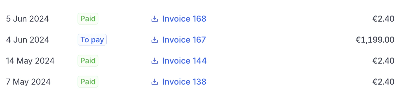
List and download invoices

Display active payment method
Getting started
1
Install the dependency
First install the
@hyperline/react-components NPM package.Install the package
2
Create an auth token
To allow a customer to see their Hyperline data, you need to generate a unique authentication token on your server side. You can use our API and the create auth token endpoint for this.
cURL
3
Integrate the React components
Then, integrate the React components. You will most likely generate a new token every time your customer accesses the page.
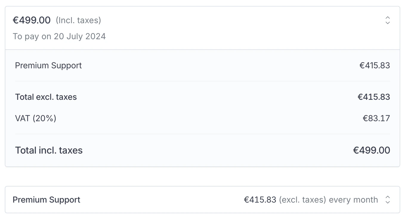
Example of a subscription
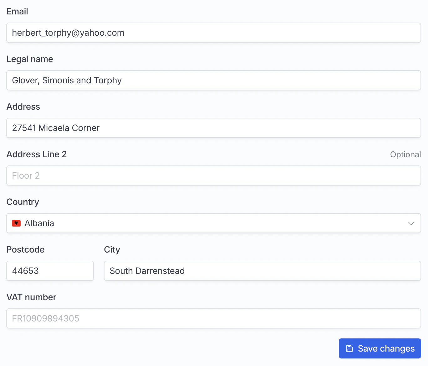
Update billing info
Components
Subscriptions
List all active subscriptionsSubscription
Display a subscription by IDInvoicesList
List and download all invoices and refundsPaymentMethod
Display the current payment method, delete it if allowed, or add a new payment methodCustomerBillingInfoForm
Display a form with all billing info, with an optional callback when the form has been successfully saved.Component options
When using the components, you will need to provide anoptions prop with the following parameters:
Appearance
You can change the colors and fonts of the component.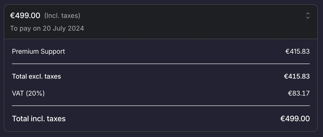
Custom color
Variables
They are meant to customise all elements at once.Fonts
Set your application’s font.srcUrl of the font filefamilyName of the font - this is the name you’ll use for thefontFamilyvariable