> ## Documentation Index
> Fetch the complete documentation index at: https://docs.hyperline.co/llms.txt
> Use this file to discover all available pages before exploring further.
# Customer usage
> Monitor real-time aggregator usage per customer with charts, filters, and event exploration
The **Usage** tab on a customer page gives you a real-time overview of all aggregator-based consumption for that customer. It automatically surfaces aggregators from running subscriptions that include usage-based products.
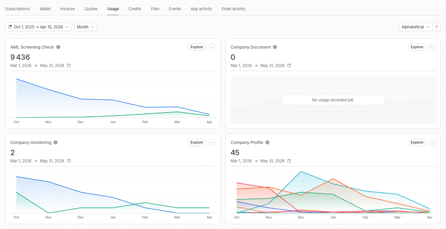 ## Aggregator cards
Each aggregator is displayed as a card showing:
* **Aggregator name** and linked subscription (if any)
* **Current aggregated value** for the active metering period
* **Area chart** of the aggregated value evolution over time (last 6 months by default)
* **Threshold lines** displayed as dashed horizontal references on the chart, with the operator and value as labels (see [thresholds](./aggregators#thresholds))
### Filters on charts
When an aggregator has [aggregator filters](./aggregators#aggregator-filters) defined, the chart displays **one line per filter** with a distinct color. A legend below the chart identifies each filter by name.
### Card display logic
The Usage tab handles different scenarios to avoid duplicated cards:
| Scenario | Display |
| ------------------------------------------ | ------------------------------------------------------------ |
| Aggregator from a subscription | Current value + subscription's metering period |
| Custom aggregator + 1 subscription | Current value + that subscription's metering period |
| Custom aggregator + multiple subscriptions | One card per subscription, each with its own metering period |
| Custom aggregator + no subscription | Aggregated value for the last month |
## Period range and grouping
Use the date range picker at the top of the Usage tab to select a custom period. You can also choose how data is grouped:
| Group by | Best for |
| ----------- | ------------------------------------------------------------------------ |
| **Monthly** | Long-term trends (presets: last 3/6/12 months, current/past year) |
| **Daily** | Weekly or monthly analysis (presets: this/last week, current/past month) |
| **Hourly** | Intraday monitoring (presets: today, yesterday, this/last week) |
Each aggregator card updates to show the aggregated value for the selected period, and charts are filtered accordingly.
Numbers in cards and tooltips use a compact format (e.g. `1.2K` instead of `1,200`).
## Sorting
You can sort aggregator cards by:
* **Name** (ascending or descending)
* **Current value** (ascending or descending)
## Explore consumption
Click **Explore** on any aggregator card to open a side panel with the underlying events. The selected date range and grouping are forwarded to the panel.
The exploration panel provides:
* **Event list** filtered on the aggregator's event key, with timestamps and values
* **Search** to find specific events
* **Date range filter** to narrow the time window
* **Filter selector** to view events matching a specific aggregator filter
* **Pagination** for browsing through large event sets
From the card's dropdown menu, you can also navigate directly to the aggregator detail page or the linked subscription.
## Related
* [Global usage](./global-usage) — same charts aggregated across all customers, with a per-customer ranking drill-down
* [Aggregators](./aggregators) — define how raw events become a billable metric
## Aggregator cards
Each aggregator is displayed as a card showing:
* **Aggregator name** and linked subscription (if any)
* **Current aggregated value** for the active metering period
* **Area chart** of the aggregated value evolution over time (last 6 months by default)
* **Threshold lines** displayed as dashed horizontal references on the chart, with the operator and value as labels (see [thresholds](./aggregators#thresholds))
### Filters on charts
When an aggregator has [aggregator filters](./aggregators#aggregator-filters) defined, the chart displays **one line per filter** with a distinct color. A legend below the chart identifies each filter by name.
### Card display logic
The Usage tab handles different scenarios to avoid duplicated cards:
| Scenario | Display |
| ------------------------------------------ | ------------------------------------------------------------ |
| Aggregator from a subscription | Current value + subscription's metering period |
| Custom aggregator + 1 subscription | Current value + that subscription's metering period |
| Custom aggregator + multiple subscriptions | One card per subscription, each with its own metering period |
| Custom aggregator + no subscription | Aggregated value for the last month |
## Period range and grouping
Use the date range picker at the top of the Usage tab to select a custom period. You can also choose how data is grouped:
| Group by | Best for |
| ----------- | ------------------------------------------------------------------------ |
| **Monthly** | Long-term trends (presets: last 3/6/12 months, current/past year) |
| **Daily** | Weekly or monthly analysis (presets: this/last week, current/past month) |
| **Hourly** | Intraday monitoring (presets: today, yesterday, this/last week) |
Each aggregator card updates to show the aggregated value for the selected period, and charts are filtered accordingly.
Numbers in cards and tooltips use a compact format (e.g. `1.2K` instead of `1,200`).
## Sorting
You can sort aggregator cards by:
* **Name** (ascending or descending)
* **Current value** (ascending or descending)
## Explore consumption
Click **Explore** on any aggregator card to open a side panel with the underlying events. The selected date range and grouping are forwarded to the panel.
The exploration panel provides:
* **Event list** filtered on the aggregator's event key, with timestamps and values
* **Search** to find specific events
* **Date range filter** to narrow the time window
* **Filter selector** to view events matching a specific aggregator filter
* **Pagination** for browsing through large event sets
From the card's dropdown menu, you can also navigate directly to the aggregator detail page or the linked subscription.
## Related
* [Global usage](./global-usage) — same charts aggregated across all customers, with a per-customer ranking drill-down
* [Aggregators](./aggregators) — define how raw events become a billable metric